A New Year Brings a New Look with the Same Great Service
Lindsay Doll | January 3, 2022

McCurdy Auction is now McCurdy Real Estate & Auction! We are excited to announce not only a new name, but also a new brand identity to go with it.
“While our rebrand started as a reflection of the changes our company and industry has gone through, it now represents so much more. With a nod to the strong reputation of McCurdy Auction, it also looks forward to the future of how we connect buyers and sellers and the evolution of auction itself,” says Braden McCurdy, CEO of McCurdy Real Estate & Auction.
As you read about our rebrand below, our overall goal is clarity: clarity of our services, brand, and simply auction itself. Click the links below for a deeper dive into our rebrand:
Logo History
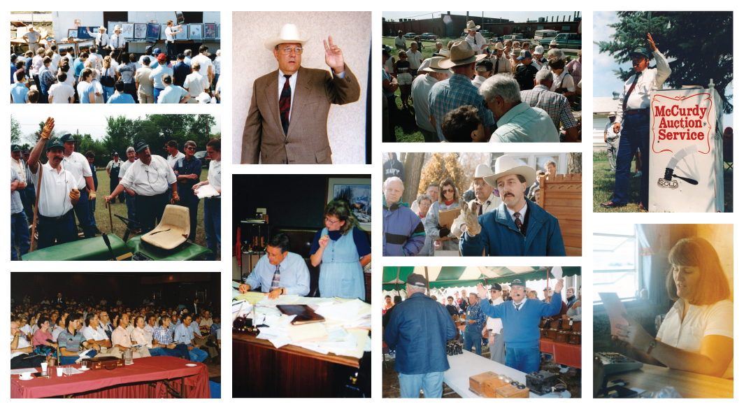
The year was 1982, and Lonny and Annette McCurdy were opening McCurdy Auction Service. While they started with personal property auctions, this quickly opened the door to auctioning real estate. By the mid-1980s, Lonny and Annette had grown their auctioneering firm from a room out of their home to a growing enterprise with ten staff members conducting personal property and real estate auctions every weekend.

The Gavel
For 40 years, the gavel has been the focal point of our logo. To the McCurdy family, it represented a powerful tool that could transform the real estate industry. However, the public more often views it as an icon associated with law. Growing up in the business, Megan McCurdy Niedens began to notice this disconnect more and more: “it represents so much to our family, but I know we have all noticed a disconnect between the icon and the public. Now, our logo represents much more by linking back to our mission statement of bringing buyers (one half of the M) and sellers (the other half of the M) together with McCurdy in the center to connect them."
By removing the gavel from the logo and changing our name, we provide a clearer image of what we do here at McCurdy.
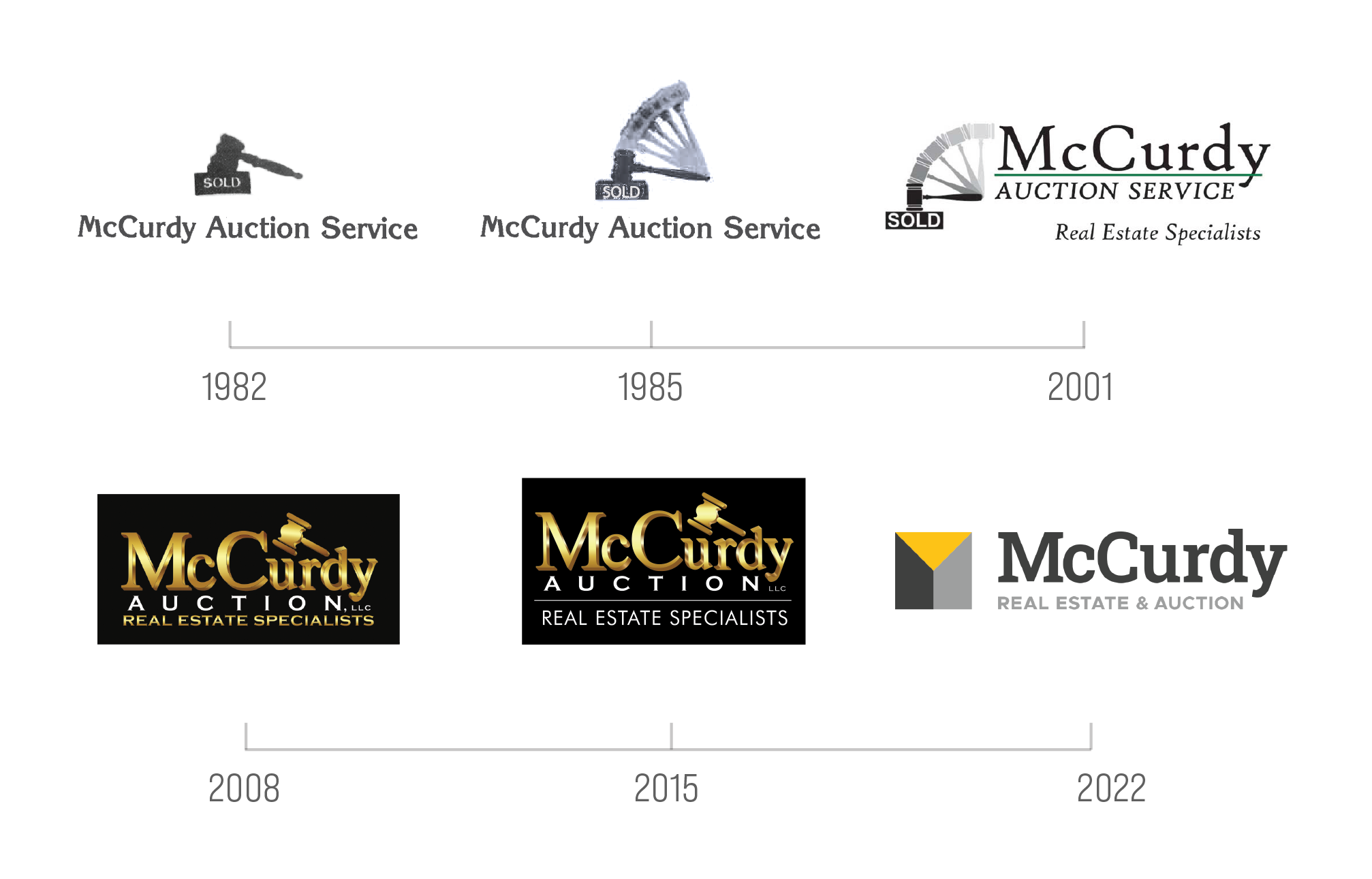
However, don’t say goodbye to the gavel just yet. You will still see this powerful symbol used in some of our graphics. In fact, let’s take a look at the evolution of the gavel over the years within our branding.

Name Change
2020 was a year of transformation for the company and the industry itself. The needs of buyers and sellers quickly shifted, so we evolved to meet these needs by offering online auctions almost exclusively. Although we didn’t realize it right away, this was a pivotal moment for our business. This method of auction has proved itself time and time again, with over 9,500 people registering for an online auction so far in 2021 alone! With such a huge step towards the future, it made us take a fresh look at our name and what that communicates to the public.
When some people hear the word ‘auction’ sometimes they think:
-
Pots and pans
-
Last resort
-
Distressed properties
-
Expensive properties
-
Not for me…
These ideas may not be true, but they are common misconceptions nonetheless. When it came to changing our name, Braden said it best: “let’s provide clarity and tell the market where we are now while showing them the future of the business.”
By putting real estate first in our name, we are able to change that first reaction to the word auction. This order does not change our commitment to the auction method of buying and selling real estate, it remains as strong as ever. “McCurdy Real Estate & Auction” more accurately reflects our services of selling real estate at auction. Simply put, it’s real estate, but better.
Accompanying the new name is a new website URL: McCurdy.com. This simplified domain name reflects the fact that our list of services includes more than just auction.
New Logo

After months of long meetings, weighing many different font options, and many lively discussions, our new logo was formed! While our marketing team put their backs into this overhaul, most of the heavy lifting was coming from our Art Director, Shawn Money.
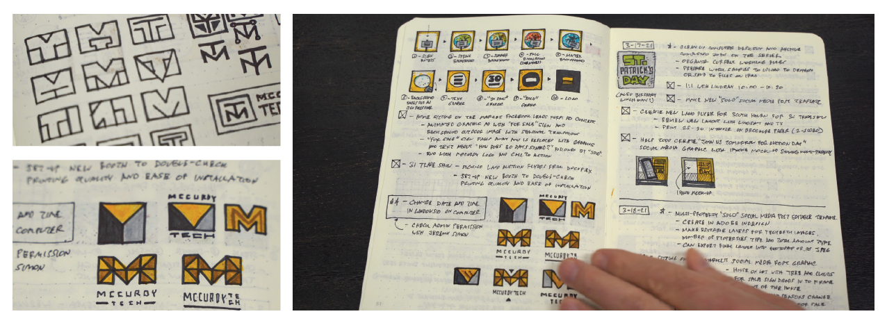
When the word “rebrand” was first mentioned, Shawn flipped back to some old sketches from a different project.

The idea of a logo focused on “M” was the start of his sketches, and with more and more ink, a deeper meaning was formed for the mark. “As I played with this abstract M, I saw a great visual representation of what McCurdy is all about: connecting buyers and sellers. One half of the M is the buyer, the other the seller, and McCurdy in the middle connecting them.”

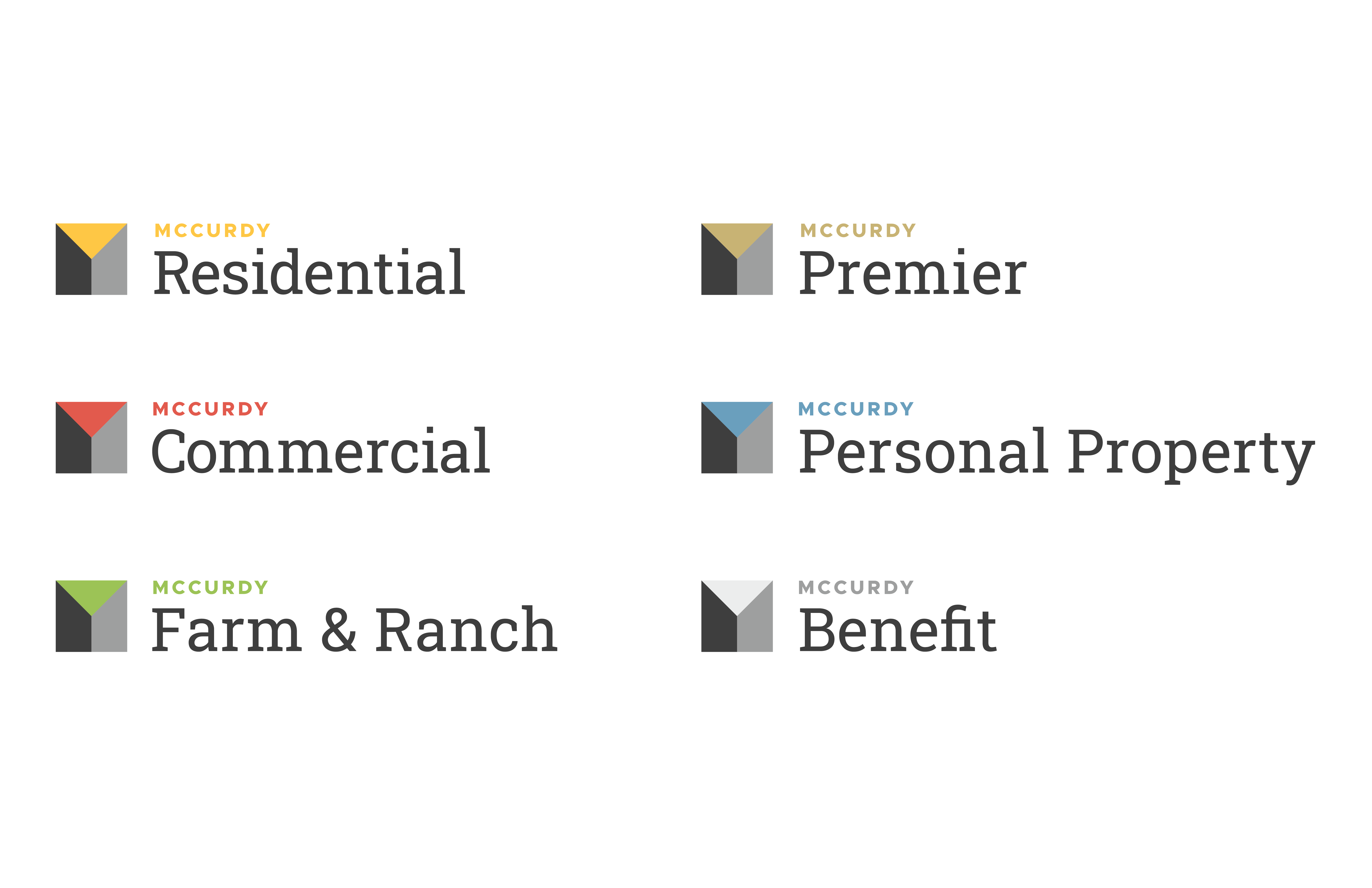
While our new logo features many new elements, there are several connections to our past designs. The most noticeable similarity is the serif font, which has always been part of our logo. In addition, we kept the basic color scheme of a bright yellow, representing the energy of auction, with black and grey accents.
Connecting to our history was important to us as a company, especially to Lonn. “While I was hesitant to start this rebranding process, the result has surpassed my expectations. We are growing and moving forward, and this logo shows the advancement we have had in the real estate and auction industry. I know I speak for all of us when I say we are excited for the future of enhanced services provided by McCurdy Real Estate & Auction.”
